
The typographic scale is a set of progressing type sizes that share a common ratio with each other. While most typographic scales appear to look the same, it’s really only the ratio that stays constant through any scale. Any base value can be established, as long as you keep to the same ratio value. Designers use this idea in almost everything that requires text. Look at a restaurant menu and you will see that the word “Appetizers” appears bigger than all of the food items below it, and “Entrees” is larger than the dishes below that. This use of a typographic hierarchy using a scale helps to categorize the menu.
Our brains rely on visual separation of text. Generally, titles, headings, and body text shouldn’t be the same size and weight because they’ll all blend in with each other. We wouldn’t be able to distinguish the different text sections very easily. One of the ways we can remedy this problem is by using the typographic scale. If we can make certain text sections like the titles be larger than the headings, and the headings be larger than the body, through the use of our common ratio, we can visually separate the text sections into their individual hierarchies.
In the case of our menu, having the headings like “Appetizers” and “Entrees” be larger than the food items below them help us understand that the items listed in the smaller font under the larger fonts are in that category of food. If I am hungry for an entree, I know to look for the big heading that says “Entrees.” Since there should be limited large text in comparison to the small text on the menu, I can find that category quickly and easily. Having a typographic scale would help give the text a bit of rhythm and flow in the viewer’s reading.
Getting into using a typographic scale can seem daunting and overwhelming at first for a beginner, but it really isn’t all that complicated. A good way of first making one is by selecting what you want for a body text size as your baseline font size. At this point, your body text is probably your smallest text and you just want to create a bit of interesting contrast in hierarchical scale without going over the top. As the designer, you can make it as simple or complicated as you want.
Once you have your baseline body text size (usually anywhere from 11px to 16px, depending on your media of choice), we can pick a scale to use. A simple choice of scale to multiply each value by would be 1.5. If we want to get a little more complex with it we can use the Golden Ratio as our scale value, being 1.618.
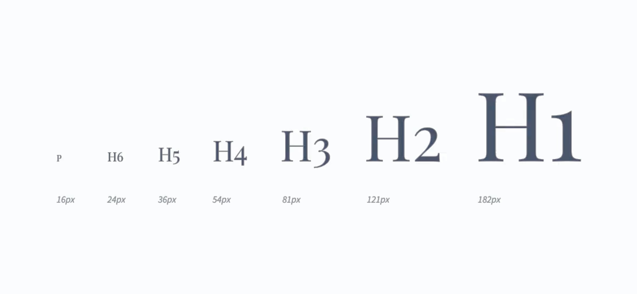
If our base value is 16px and we choose a ratio of 1.5 to multiply by, we can do 16px∗1.5 which will equal our next value up the scale, 24px. We can keep going with these values by multiplying our last calculated font size value by our scale 1.5. Thus, our values would proceed as 16px, 24px, 36px, 54px, 81px, 121px, and 182px.

With keeping this in mind, we don’t need to use all of the values we calculate. Having too many varying font sizes in any context will create confusion and there won’t be enough contrast in font sizes to group certain texts together. It’s really up to the discretion of the designer to decide how many you want to include, but they should generally be used in order of size progression and not have certain values be skipped around.
Mortensen, Spencer. “The Typographic Scale.” Spencer Mortensen. Accessed April 1, 2021. https://spencermortensen.com/articles/typographic-scale/.
Powell, Kevin. “Using a Typographic Scale: Using a Typographic Scale.” Kevin Powell, October 27, 2018. https://www.kevinpowell.co/article/typographic-scale/.
Purdila, Adi. Typographic Scale. December 14, 2018. Envatotuts+. https://webdesign.tutsplus.com/courses/a-beginners-guide-to-using-typographic-scales/lessons/what-is-a-typographic-scale.
“Typographic Scales.” Spec. Accessed April 1, 2021. https://spec.fm/specifics/type-scale.
Weychert, Rob. “A Modern Typographic Scale.” 24 Ways, December 19, 2019. https://24ways.org/2019/a-modern-typographic-scale/.